
[Art Direction] [Brand Guidelines] [Rollout]
Henry Bloom has been making Australia happier and healthier since 1938. As a brand however, Henry Blooms was fragmented, had little share of voice and was not representative of their fantastic range of products and their associated health benefits.
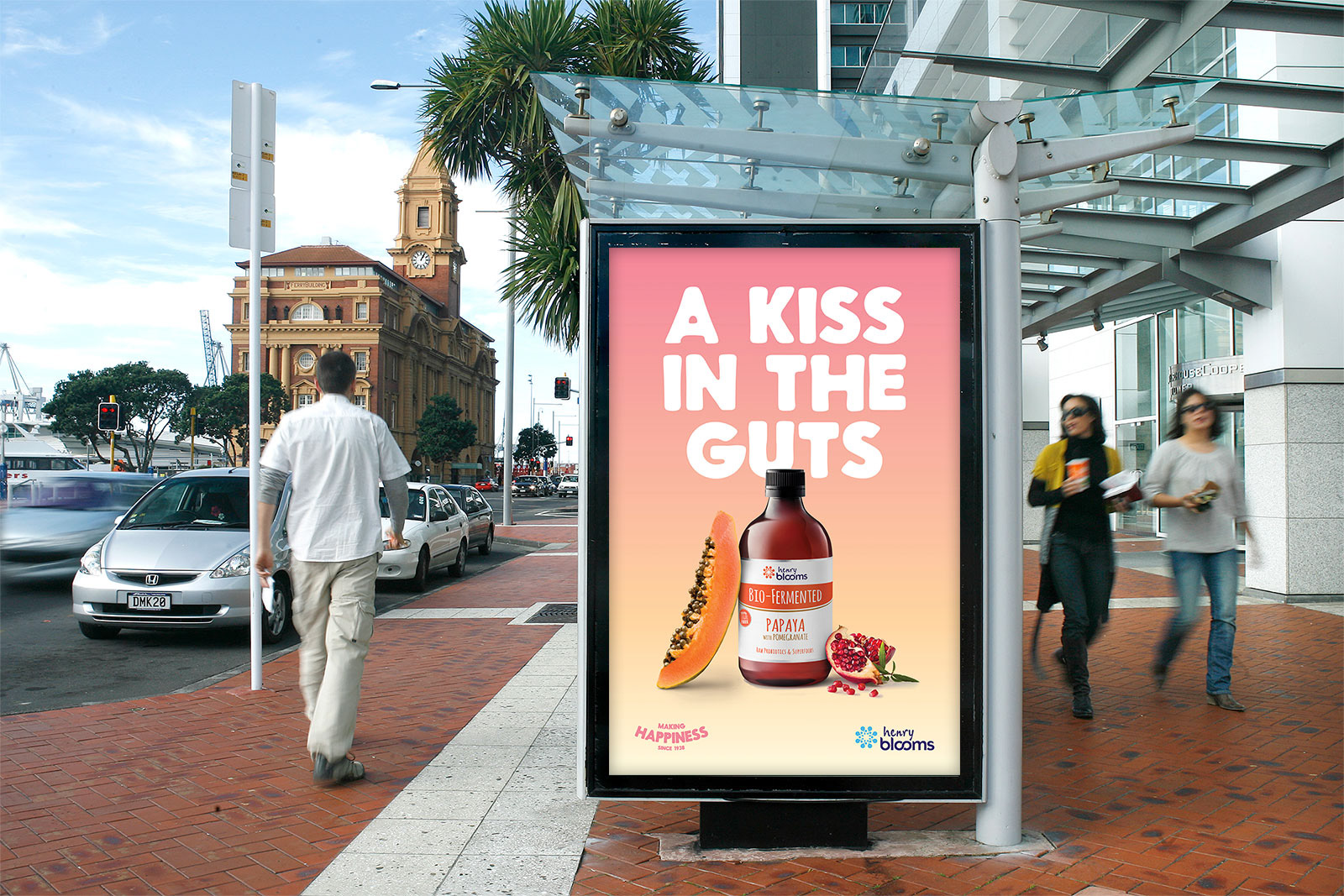
The challenge was to rejuvenate the brand – injecting it with a dose of irreverent personality, fun and energy.
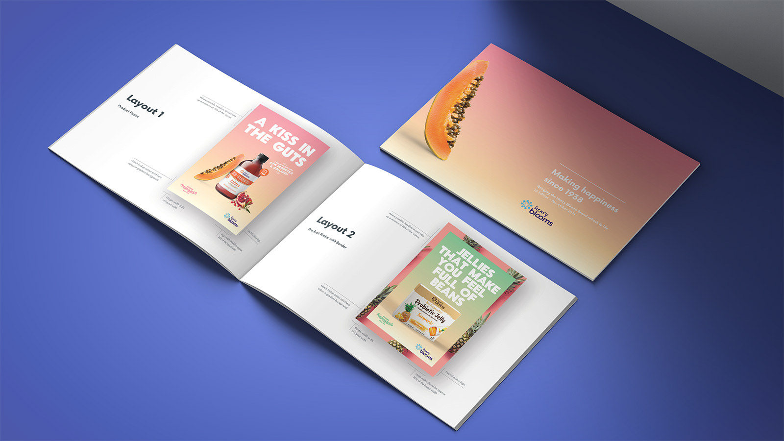
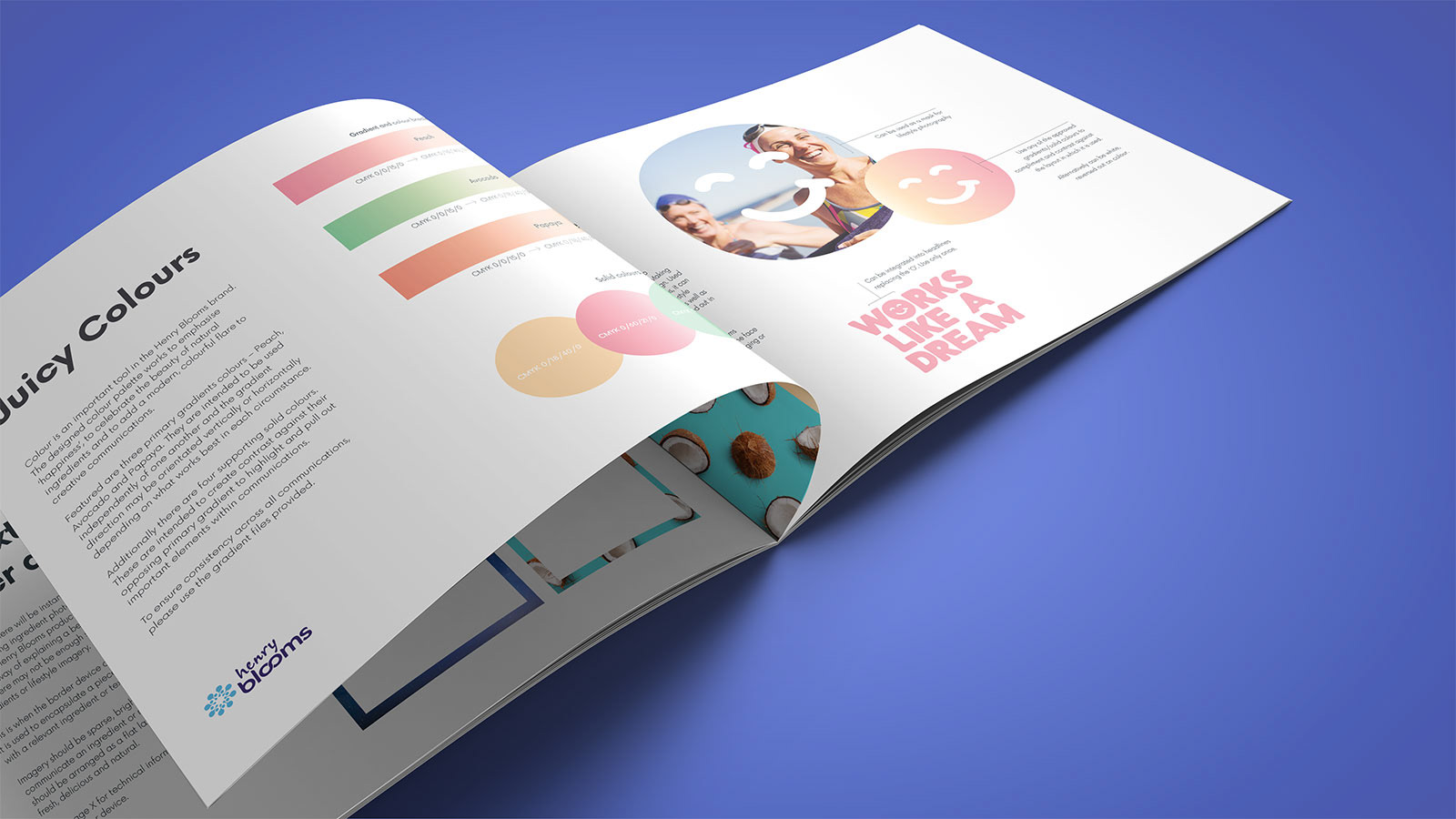
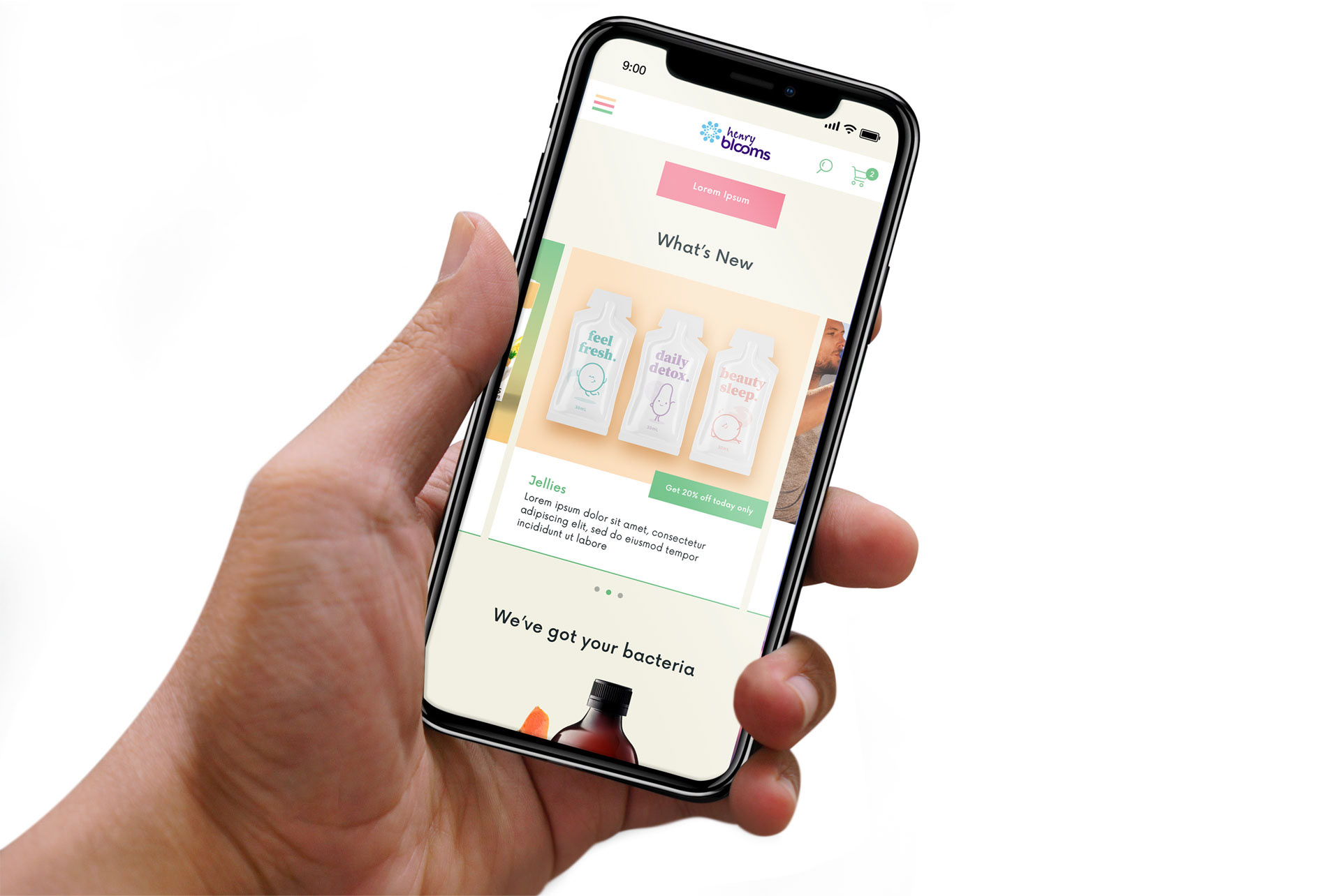
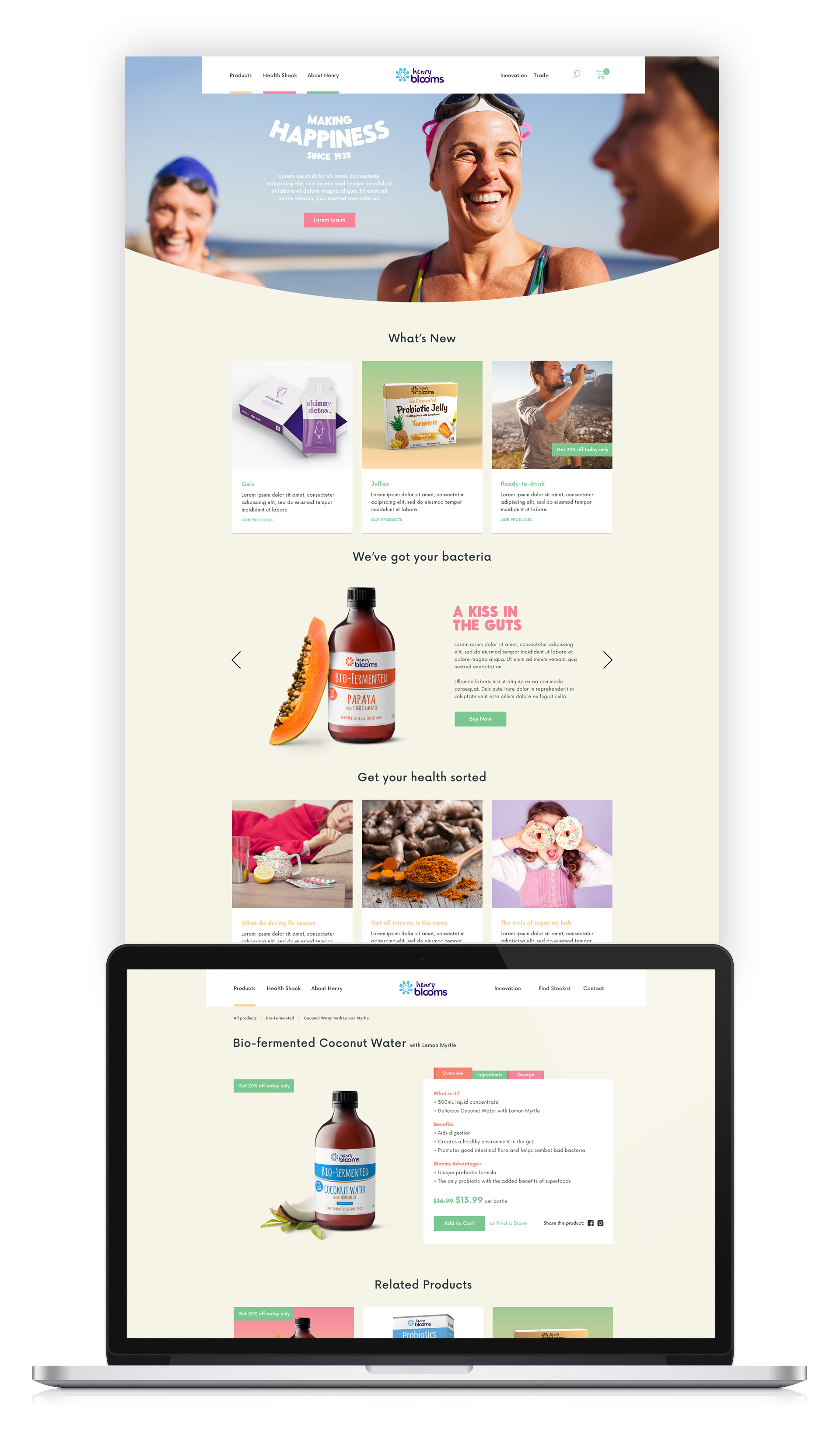
The solution was to create a look and feel inspired by beautiful ingredients and happy Australians. The communications were all predominantly message-driven so it was important to create funky type that complimented the brand's new-found quirky personality.