[Branding] [Art Direction] [Brand Guidelines] [UI]
SunRice is one of Australia's largest food exporters, recording revenue of over $1 billion dollars in 2017. Despite this, SunRice never had the brand consistency that reflected their high-quality products and international success. As part of their new brand positioning, "Taste the SunRice Difference", a new brand look and design system were created. The new look had to be engaging and consistent across all SunRice communications and products, celebrating SunRice quality rice as the staple ingredient for delicious Aussie meals.

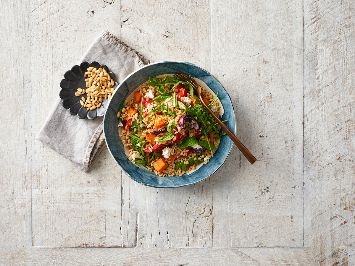


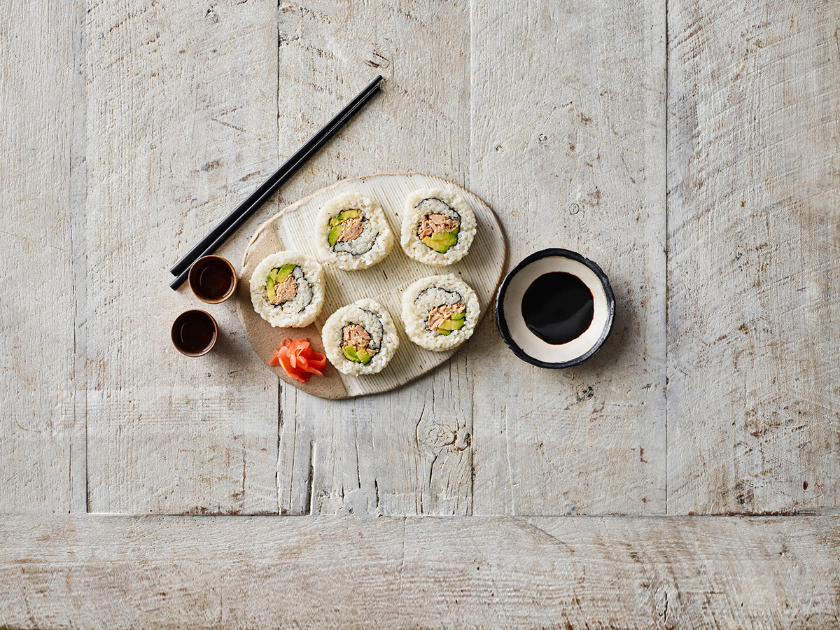
Working collaboratively with the client and development team, I was tasked to lead the UI component of the SunRice website rebuild. The objective was to adapt the new brand into a user-focused, mobile-optimised, go-to source for delicious rice recipes as well as to showcase the incredible range of SunRice products and the world-class quality of their rice. Go ahead, lick the screen.

